Back to Design Work
Moving Helper Site Redesign
Project Context
Business Chanllenges
Moving Helpers is an online platform by U-Haul where independent labor providers can offer services such as packing, loading, and cleaning. Customers needing moving assistance can book services through uhaul.com, and movers are notified once a booking is made. Notably, the platform has one of the lowest marketplace fees in the industry.
However, the site was not mobile-friendly, forcing movers to use a desktop view to manage jobs. Even on desktop, the workflow for scheduling services and processing payments was highly inefficient.
Design Process
Understand our movers
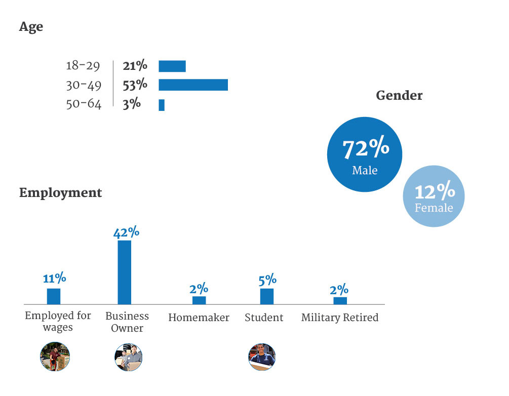
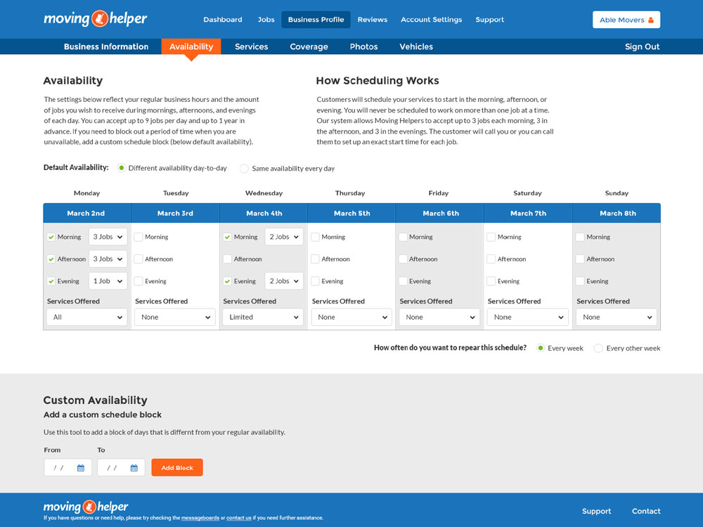
U-Haul's research indicates that 42% of the movers are small business owners looking to expand their operations through this platform. For these users, the ability to get paid quickly and customize their schedules on a weekly basis is crucial.
Information hierachy
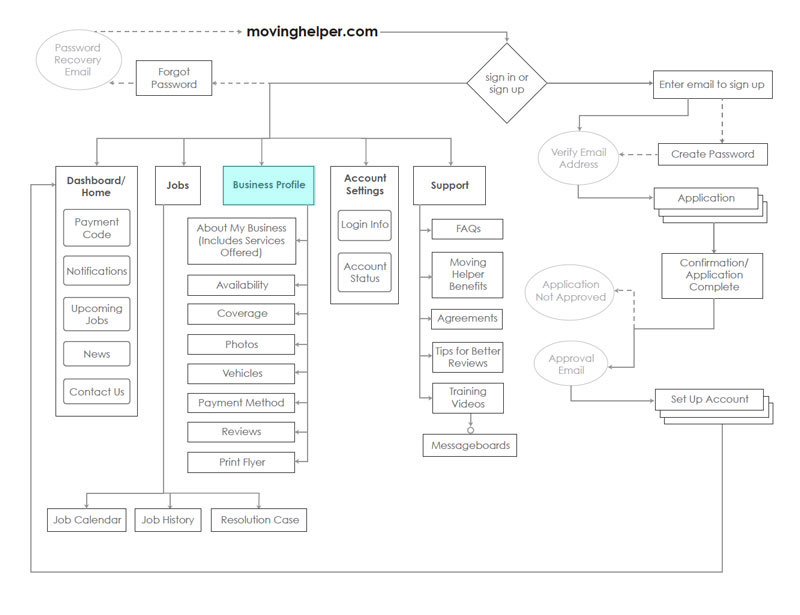
I approached this project by developing an improved information hierarchy for the site. I illustrated, hierarchically, the series of pages users need to navigate to access and complete various tasks.
Based on our company's research findings, we decided to separate business account information from the general account settings view. This adjustment aimed to streamline the workflow specifically for small business owners.
The sign-up and application process fall outside the scope of this project. Our main focus is on enhancing workflow efficiency for existing movers.
Desktop Wireframes
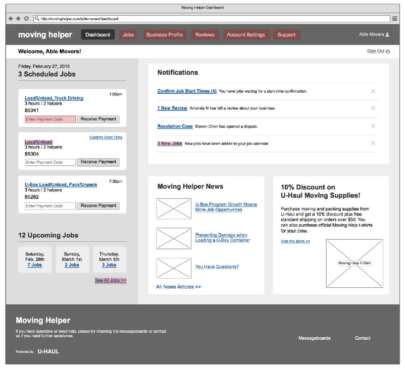
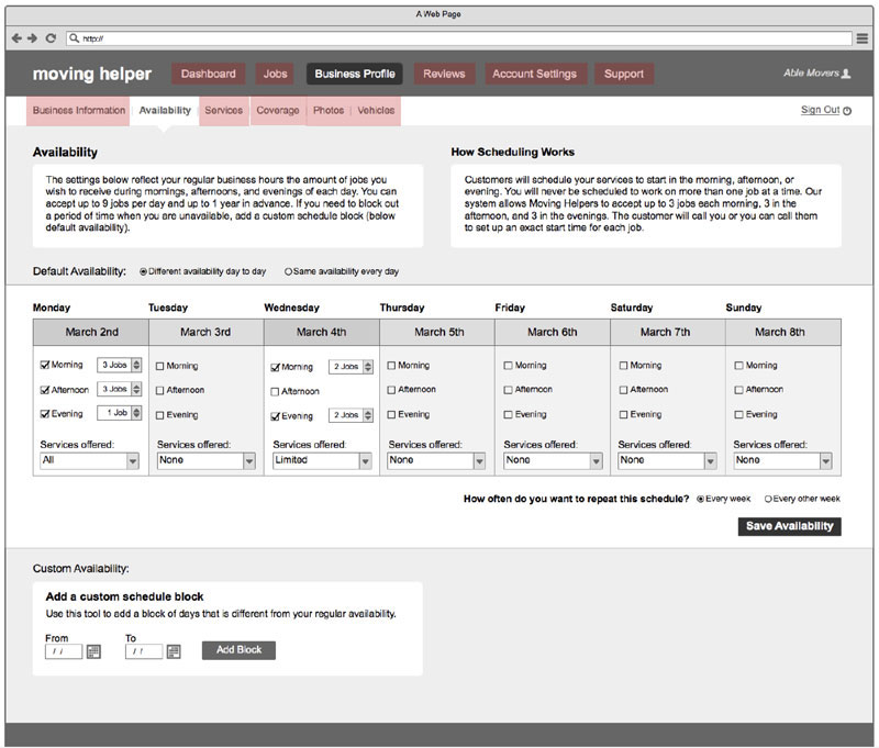
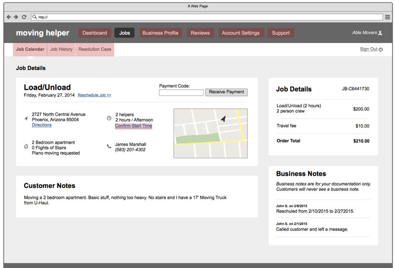
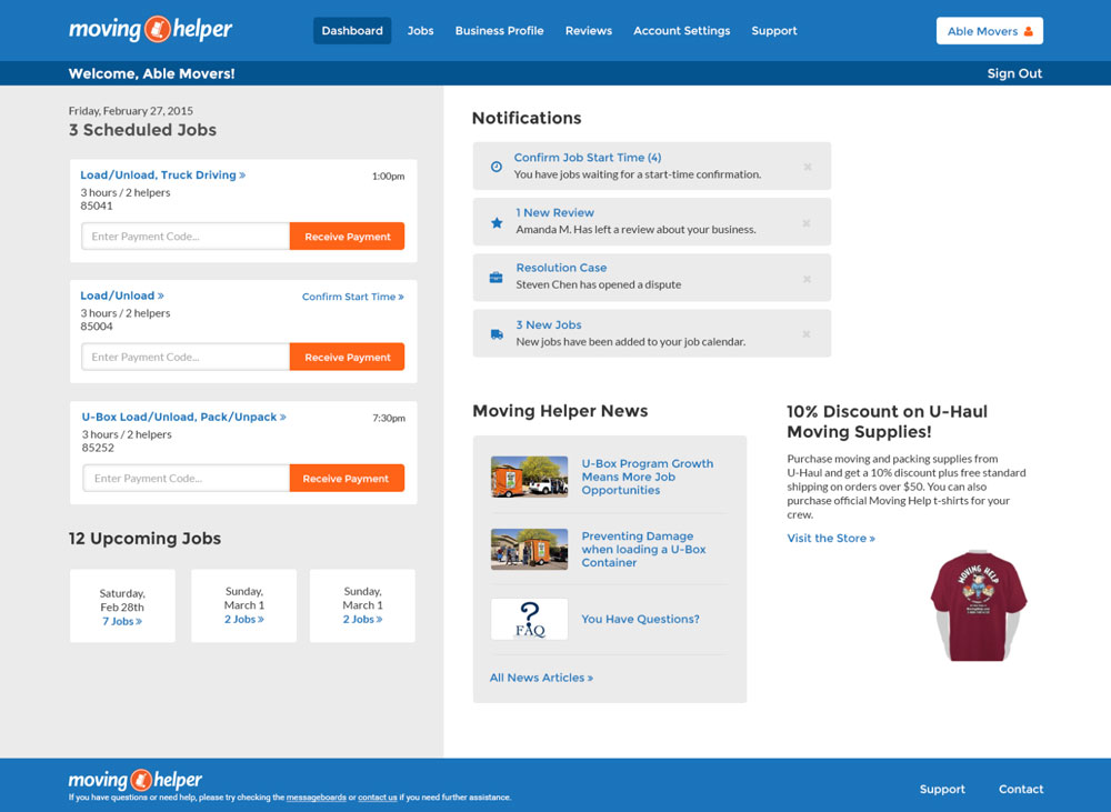
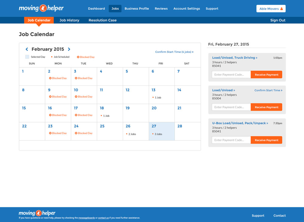
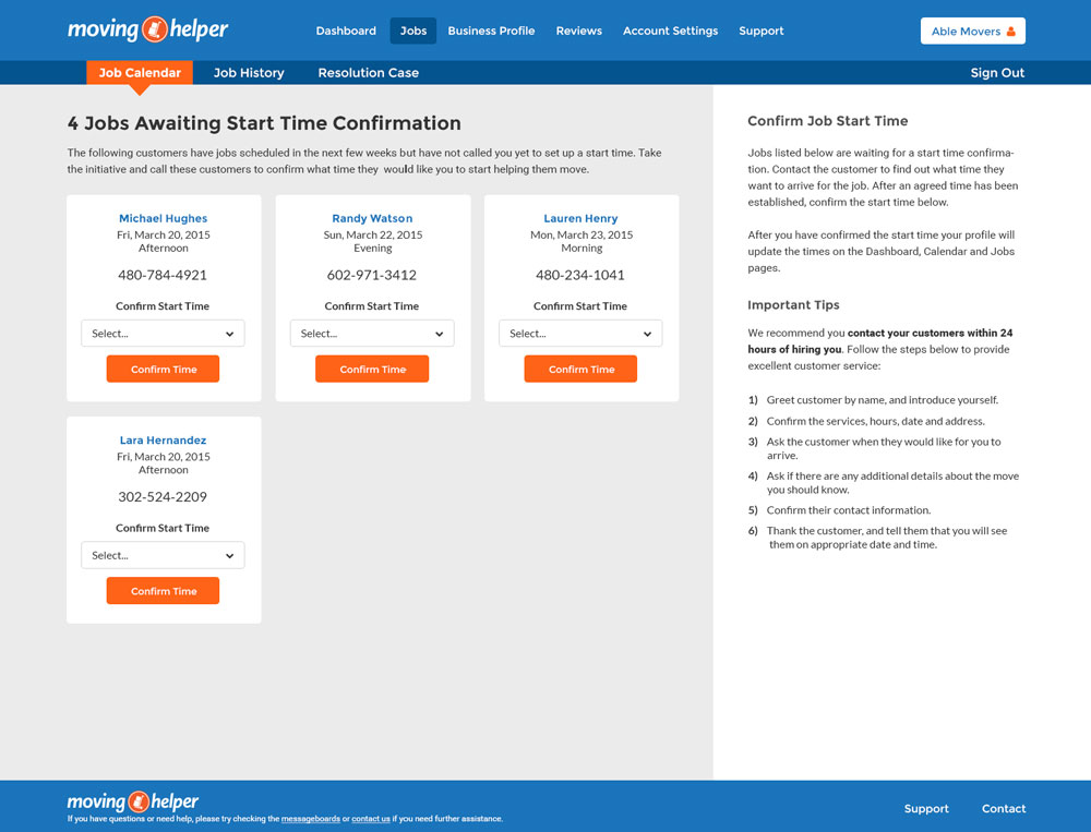
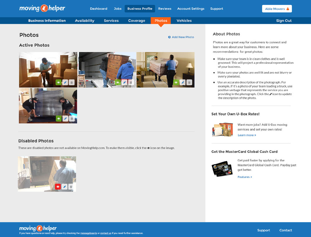
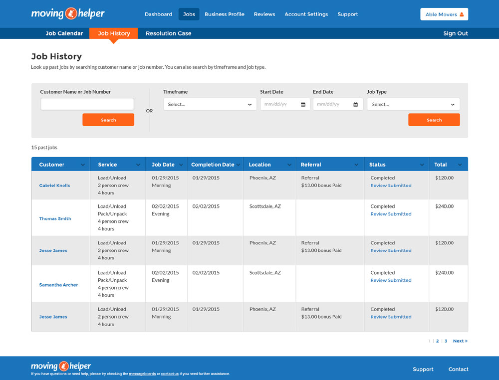
The overall layout of the site adopts a card-based design pattern, which performs well on both desktops and mobile devices. Each container contains bite-sized information serving as entry points to more detailed content. This approach ensures a consistent experience across devices.
Tool used for wireframing: Balsamiq
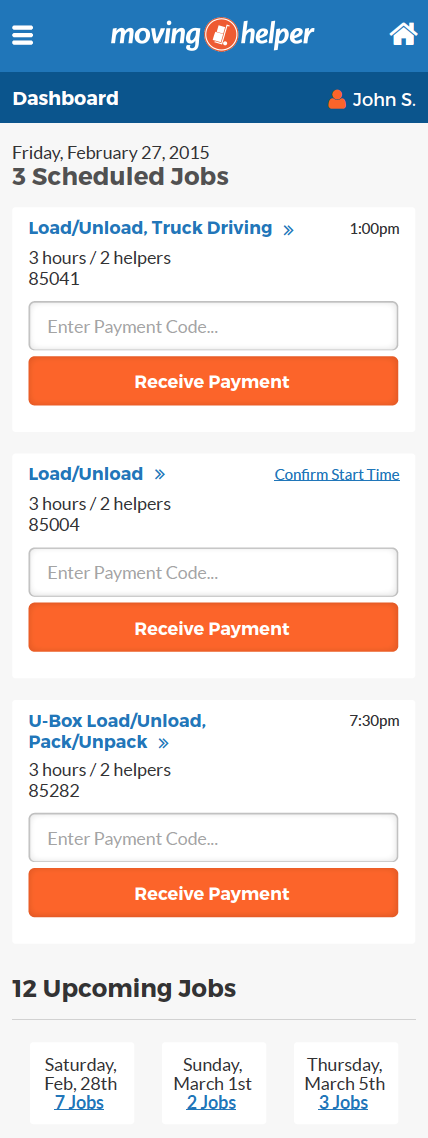
Dashboard/Overview
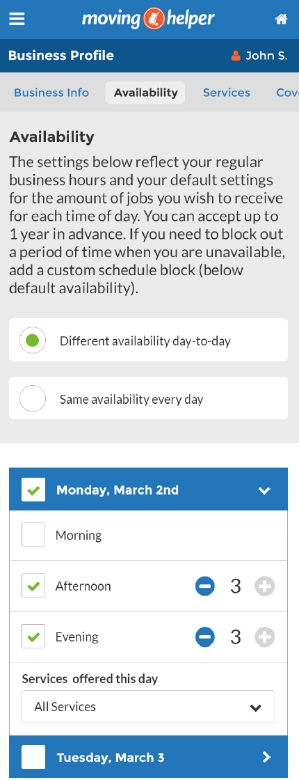
Business profile - Job availability
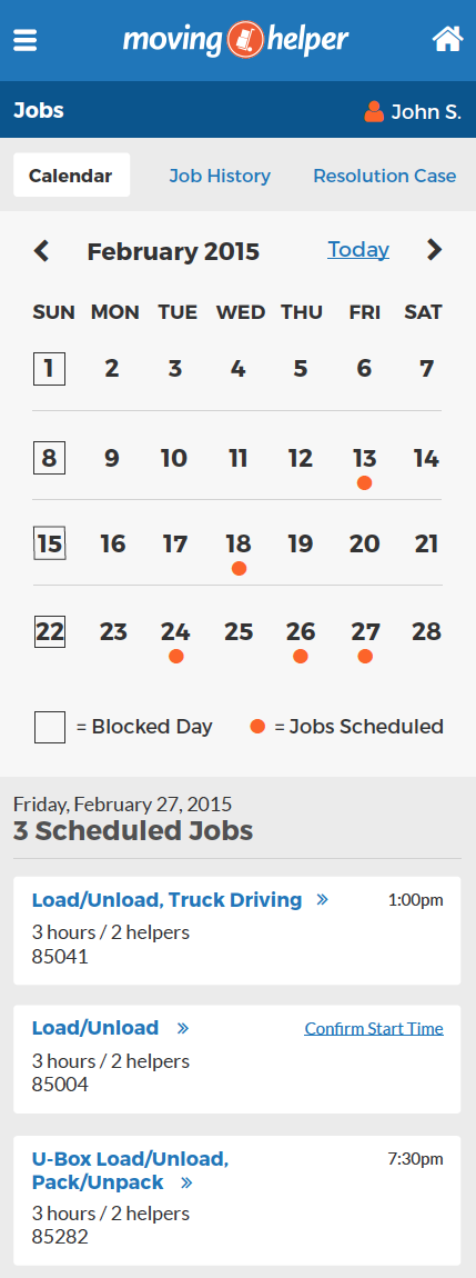
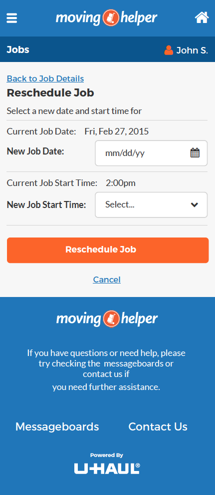
Jobs - Job details
Mobile Wireframes
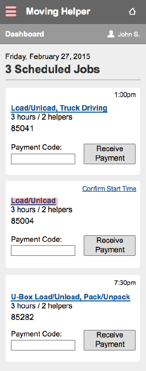
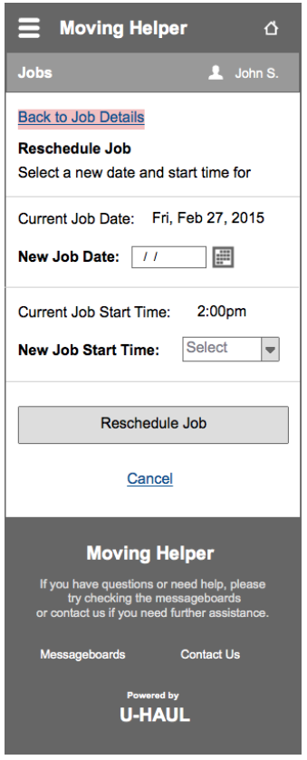
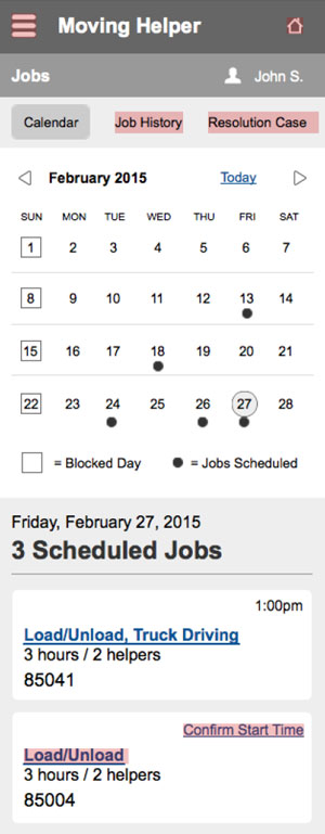
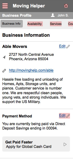
In the mobile design phase, I collaborated closely with the project manager to identify the key tasks that users needed to perform on mobile devices. We then optimized the layout accordingly to ensure an efficient and user-friendly experience.
Desktop Visual Design
Mobile Visual Design
